
My brand new storyboard reel for your inspection and (hopefully) enjoyment :-)
Showing posts with label storyboard. Show all posts
Showing posts with label storyboard. Show all posts
Saturday, April 09, 2011

Saturday, June 13, 2009
JOUST by Mike Koizumi

Amazing manga-style action storyboard (well…it’s practically animated, really).
Saturday, February 28, 2009
Dysfunctional dam - environment prep
I'm not so good at set design, but here's my rough attempt at two POVs in the room. This is a beaver's home, so the way to get in and out is by diving through a hole in the floor. I gave the hole a door, and placed some towels by the entrance. I'm going to have mama beaver wash dished, and I thought it would be cute if the "sink" is just another hole in the floor. The junk food is needed for the script, and I knoe the stove is a bit strange - but what the hey, I missed a big round shape and pushed in a stove. Sue me.


Dysfunctional Dam - prep designs
For my next storyboard assignment....
The script I chose is about a domestic fight in an inter-species family. Mom is a beaver, dad is a raccoon. I wanted them to look like one of those couples who are so busy in day-to-day survival, that they can't see the big picture anymore. They forgot what's really important, and so they get more and more beaten, bitter and fat by the day.


A few older versions:


Friday, February 27, 2009
His or Hen's - preperation sketches
I forgot to mention that the "His or Hen's" story was developed by me and my girlfriend together. Couldn't have done it without her.
 I'm not much of a color person, somehow I get bored by very detailed color work. I threw in some colors just as an indication, but I wish I had the patience to really make a painting out of this. I can see a lot of opportunity for interesting lighting here.
Thursday, February 19, 2009
His or Hen's


Friday, April 11, 2008
Springboard: a storyboarding software
A long time ago I promised to tell y'all about Springboard, a small but powerful storyboarding software I'm using. I love this software, and here is why.
- Basic drawing tools: the drawing tools are good enough for getting the point across, but they're too simple for beautifully executed artwork. This makes it easier for me to stay focused on storytelling.
- Zoom: you can zoom in and out. It's great to be able to take a step back and "watch the film", then go in again and draw. These screenshots show my 'story pass' for "catch!".


- Export/Import: When I was happy with my story pass, I did a 'drawing pass' - exported the panels, re-drew them in a different program, and imported them back in. You can even do this automatically, using an "external editing" feature.
- Presentation: Once the stuff is ready, Springboard offers an amazing variety of presentation outputs - you can pretty much arrange the panels into every storyboard format known to man. You can export them to HTML, as I've done in my previous post. The presentation can include text (there's a text box for each panel), timing (you can time it inside Springboard, play it, and even export it as AVI), headers, footers, filename, date - you name it.
- It's CHEAP!
Check it out! The trial version is fully operational except for printing (at least, that's the way it was when I first tried it).
Thursday, April 10, 2008
Catch!
 A while back, I tried to come up with a 4-legged animation exercise - and somehow ended up with this silly 1 minute short. Maybe I'll even animate it some day, who knows :0)
Click the picture to see the complete storyboard.
Saturday, December 09, 2006
Quick & Dirty Storyboarding (2)
[continued from previous post]
As promised, here are some specific things I found useful in my quest for simplicity:
- I started out drawing on a 400x225 canvas size, but later decided to go even smaller. The boards I posted were drawn on a 200x112 canvas, which physically limited my ability to refine.
- My previous attempts had 2-3 frames per shot, as I would try to convey the progress within the scenes. Later I decided to try and keep to a single frame per shot, which really helped me stay with the big picture (for the final storyboard I will need more drawings, of course - but not for this initial stage).
- In an effort to keep the staging simple and clear, I started attaching a short line of text to each frame, describing the "statement" of the drawing (e.g. "takes out sandwich", "notices bird").
- Every time I felt a need to start fiddling with something that looked wrong, or I had an great idea I wanted to add - I attached a note instead . My rough board is full of stuff like "could be cut" and "camera closer + pan up". Once it's there, I can relax - I know I'll remember to change it in a later stage.
D.
Tuesday, December 05, 2006
Quick & Dirty Storyboarding


 So here it is - the raw, crude, totally not-working-yet storyboard for my silly gag short film. If you don't understand what's in it, that's because it wasn't meant for anybody but me to understand. If you do understand, well, just don't tell anybody how silly it is :). The reason I'm posting it is to share some thoughts about the process.
I know that some people are such master draftsmen and storyboard artists, that they can draw and tell a story at the same time. Not being a master anything, I need a chance to explore my storytelling ideas without having to actually draw.
I therefore decided to go through the whole story and just note (not draw!) visual ideas as they come, trying not to edit myself too much. I knew the result was going to be far from working - but at least it would be something to work with. The result is in front of you. I think it worked - I feel that I now have a solid piece of raw material that I can start molding into shape.
In the next post, I'll mention a few "tricks" that helped me stay out of too much detail. I'll also say a few words about the excellent storyboarding software I used, called springboard. Stay tuned.
Saturday, November 18, 2006
Symbolism in staging - 1
For several months now, I’ve been spending a lot of my time at work storyboarding. Fortunately, my boss is an excellent storyboard artist, and I got to learn a lot from his comments on my work.
One of the interesting things he introduced me to, was the use of visual symbolism. What does that mean? Well, it means using composition to visually hint the audience about the characters and their relationships.
Yeah yeah, we know
Yes, we’re all familiar with the classic tricks of the trade: a small character in a huge background conveys the character feeling alone and insignificant, an up shot angle makes the character feel powerful and intimidating, and so on.
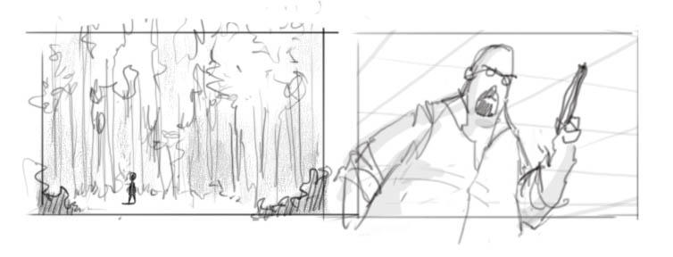
However, using tricks is different than understanding the profound ideas they represent. Visual symbolism is a strong communication tool that can be used in almost every shot, not just in special predefined cases.
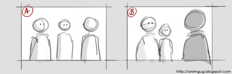
Consider the following situation: two characters confront a third character - say, two students ask their professor to postpone a test. The sketch bellow shows two ways of staging the conversation:
Get in shape
First, let’s look at the silhouette.
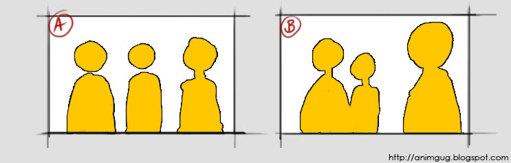 Notice that in picture B, there are two distinct shapes: “students shape” and “professor shape”. This visually communicates to the viewer that in this particular situation, the students are grouped together against the professor. Picture A says “Mike, Jane, professor”; picture B says “students, professor”.
 Divide and conquer
Next, let’s have a look at the way the characters divide the screen space:
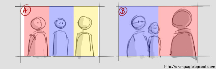
In picture A the screen is divided to thirds. The characters seem to “share” the screen, which makes the conversation feel more friendly. We want to suggest confrontation, so in staging B, the two “groups” are placed on either side of an imaginary middle line. This visually communicates “they’re on one side, he’s on the other side” – in other words, confrontation.
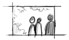
Here, the students are still silhouetted together, but now the characters don’t cut the screen in half. While we still have two “groups”, I don’t think this feels as confrontational as the original.
Made you look!
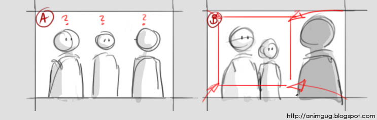
Picture A is confusing to the audience: who’s the main character? Where should we focus our attention? Notice how picture B creates an area of interest around the students’ faces. Being in the front, the guy on the left becomes the obvious star of this particularly shot. Try to look at any other area of the shot, and your eyes get almost forced into looking at him.
All this doesn’t mean that picture A is “bad staging” and must never to be used. For example, if we had a situation where three friends who got lost are trying to figure out where to go next - this shot could be perfect! It suggests exactly friendship, individual opinions, and confusion. Staging B, as we’ve seen, communicates confrontation and hierarchy. The two sketches tell us two very different stories, with nothing but pure staging – no poses, text, or facial expressions!
Subscribe to:
Posts (Atom)

