
Well, I'm not posting here as much as I would have liked, but what the hey. Doing my best.
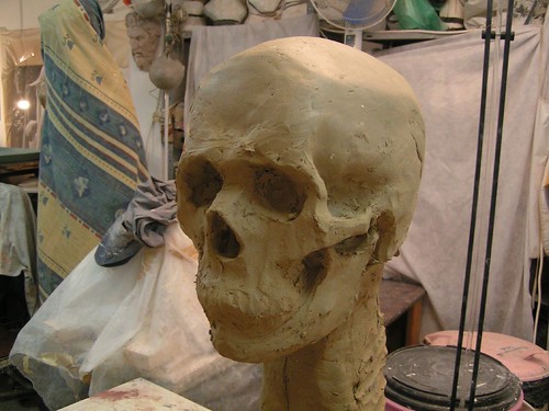
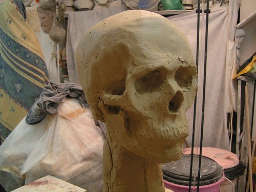
After dreaming it from plenty of years, I've finally taken sculpting lessons. So far it's a huge pleasure, worth any penny and every moment invested. The head above is the model for my very first sculpting mission. I've started by sculpting the underlying skull. Below is the result after two lessons (about 6 hours). Judging from my teacher's response, I think it must be fairly quick for a first try.
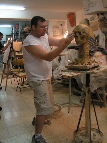
And me:
I'll keep y'all posted as the thing comes along.
Wednesday, August 29, 2007
Sculpting frenzy!


Thursday, August 23, 2007
Joseph Christian Leyendecker
Here are a bunch of great illustrations by Joseph Christian Leyendecker. Enjoy!
Friday, August 17, 2007
Hair

A few doodles from a meeting at work, loosely based on a fellow animator. For some reason, he didn't seem to like me having fun with his face. Go figure :)
Thursday, August 16, 2007
Team Fortress 2 trailers and teasers
Well, here's something I haven't done before in this blog: embedded teasers. However, I think the artistic value of this stuff is so great, that it absolutely justifies stepping out of character. So, here as some teasers for a multiplayer game called Team Fortress 2, and I think you'll agree that the character design could have easily made a Pixar feature film
Meet the Heavy: The heavy weapons character introducing himself. Excellent performance!
The Teaser:
Illustrative Rendering Featurette: A short presentation touching on artistic decisions and tech solutions.
And finally, a trailer showing some in-game footage:
Well, isn't that juicy? Can't wait to play already!
Saturday, July 21, 2007
Bertrand Russell Doodle
I was working on a character concept for something, and I remembered the philosopher/mathematician Bertrand Russell, thinking he might make a good reference. Here's a quick doodle I did based on his features (which, by the way, didn't work for my character at all).
Friday, July 06, 2007
To be honest
I have to admit: when browsing through my art blog feeds, I usually look at the pictures, briefly go through the the text, and proceed to the next blog. A post from Emma's "Art, plz" blog made me stop and read carefully. It's really, really well written. It has a touch humor, a touch of personality, and a ton of wisdom. And good sketches to go with it, too! No wonder she works for Pixar. Have a look. Then come back, I want to add something.
[No no, don't continue - read her post first!]
So.
That, folks, is the catch22 of good artwork: if you focus on good form you lose the honesty, if you don't – you lose your audience. How do you get honest, then?
Friday, June 29, 2007
Ecologists

This was done for a forum drawing challenge under the title "Mom! Dad! Look what I found!". I took a big breath and plunged into some experimental painting. I have to say, I sort of like the result.
Strangely enough, my conscious brain had no say in choosing the subject... My hand just kept doodling silly dinosaurs, and after a few attempts to regain control, I just decided to play along and do something with dinosaurs.
Strangely enough, my conscious brain had no say in choosing the subject... My hand just kept doodling silly dinosaurs, and after a few attempts to regain control, I just decided to play along and do something with dinosaurs.
Friday, June 22, 2007

My business card trio
 I designed these business cards with the idea that people would be able to choose the one they like. So far it's not working too well, everyone seem to want all three of them :)
It's interesting that, when I ask people which one they would have preferred, they don't have to think about it much - one of them is always much better than the rest. But it's not always the same one; in fact, the distribution between the 3 cards is quite even. I like that.
Monday, June 18, 2007
My Google Reader shared items page
Google Reader is an amazing tool for keeping track of your favorite blogs (and any other internet content that supports RSS). Among other goodies, it also allows you to create your own "shared items" web page, to which you can very easily (a single click) add interesting items. What you're practically doing is creating your very own "web magazine", sort of a mozaic blog made of bits and pieces you find interesting.
Long story short, HERE is my google reader share page (I'm also adding it to the links list on the right). You can find there a link to the RSS feed, to help you follow.
Enjoy!
Saturday, June 09, 2007
Angry dude

Did that as a caricature for something, but I won't tell you what it means. Make of it what you will. And if you come up with something interesting, write us a comment, won't you?
Friday, June 08, 2007
Policeman
 This one started out as a fun little morning doodle, but I think I got rid of most of the fun now. Some of it is still there though, and I haven't been posting anything lately, so here it is. Comments and whatnots are, as usual, very welcome.
I decided his name is George, if that's ok with everyone.
Saturday, May 05, 2007
Old and Gray

Don't worry, I'm quite cheerful these days. I bought a new, wide format A5 Wacom - and you're watching the very first doodle I made with it. Things are slowly falling into place now, and soon I'll be updating regularly again.
Saturday, April 28, 2007
She Donkey, or: the beauty of ugly drawings

Some months ago my Dad was complaining to me about a cartoon he was trying to draw, which was giving him a hard time. The drawing involved a guy riding a lady-donkey, who obviously had the hots for him (don't look at me, it's his idea!).
I offered to help, and he agreed. So I took a bunch of papers and started doodling, just idly exploring some possibilities. Dad was puzzled; as an amateur cartoonist, he was sure his professional son is going to be able to just draw the thing right off the bat - which was what he was trying to do the whole time.
In my mind, however, being a pro means more than having more knowledge or better tools. It also (perhaps chiefly) means better problem-solving strategies. It's the ability to recognize how complex a problem really is, and finding ways of breaking it down so it can be dealt with one step at a time.
That drawing Dad was trying to make requires designing two characters, communicating the donkey's feelings (and the guy's reaction), all that while dealing with the weight and pose problems that come from one character sitting on top of the other. Add staging, donkey anatomy, composition, and the usual challenges of drawing, and it becomes clear that trying to do all that in one step, is really asking for trouble.
He got the idea pretty quickly. We sketched together for a while; below is a collection of some of the butt-ugly drawings we made. The hopefully nice she-donkey design at the top of the post, is based on these careless doodles. By allowing ourselves to explore without fear of ugliness, we were able to explore a lot of ideas before making a commitment.

I offered to help, and he agreed. So I took a bunch of papers and started doodling, just idly exploring some possibilities. Dad was puzzled; as an amateur cartoonist, he was sure his professional son is going to be able to just draw the thing right off the bat - which was what he was trying to do the whole time.
In my mind, however, being a pro means more than having more knowledge or better tools. It also (perhaps chiefly) means better problem-solving strategies. It's the ability to recognize how complex a problem really is, and finding ways of breaking it down so it can be dealt with one step at a time.
That drawing Dad was trying to make requires designing two characters, communicating the donkey's feelings (and the guy's reaction), all that while dealing with the weight and pose problems that come from one character sitting on top of the other. Add staging, donkey anatomy, composition, and the usual challenges of drawing, and it becomes clear that trying to do all that in one step, is really asking for trouble.
He got the idea pretty quickly. We sketched together for a while; below is a collection of some of the butt-ugly drawings we made. The hopefully nice she-donkey design at the top of the post, is based on these careless doodles. By allowing ourselves to explore without fear of ugliness, we were able to explore a lot of ideas before making a commitment.

A sign of life
As was expected, the move to Israel is causing some blogging stagnation; being homeless, usually internetless and also having lost my Wacom pen, makes things a tiny bit difficult. But not to worry; the blog is on my mind and I plan to get busy updating it the moment I settle a bit, which should be in about 2 weeks or so.
In the mean while, just to show I mean business, I'm preparing a post with some scanned stuff and a few thoughts. Coming right up.
Sunday, March 18, 2007
Yet another attempt at a self caricature

This is me. I think. Maybe. Dunno. Is it? I probably look a bit younger in real life, but after years of failed attempts, I'll settle for a recognizable older me.
Haven't been very active lately on my little online sketchbook here, but this is not because I've been lazy or unproductive. I'm actually working on some really interesting things these days, only these are not yet ready to show off.
I'm doodling all the time at work, and some of it is pretty funny. maybe I'll get some of it scanned and posted soon.
Friday, March 02, 2007
Idle doodles [1]
 Just draw, is all I say. Don't make it a sacred thing that needs to be solemnly scheduled and prepared. Keep a pen and a bunch of papers at hand, so that you can doodle around whenever your hands are free. You'll find that cool drawings have a tendency to happen on the back of a coffee-stained paper napkin. Don't worry about it, it's just part of the crazy way the universe was built.
Above - a strange doodling session, that lasted the whole day: Every time the computer was rendering an animation preview, I did one or two of those. As for what it means, your guess is as good as mine.
Sunday, February 18, 2007

Monday, February 05, 2007

Tuesday, January 30, 2007

Sunday, January 21, 2007
Bird flew
 I've been wanting to try animating a small bird for ages, bun never got around to it. So when I started on this silly short film venture, I thought - hey, as long as it's silly, it might as well have a bird in it. So here we go - my first bird animation test. What say you?
Friday, January 19, 2007

Sunday, January 14, 2007
Stanly & Ron
I've been wanting to do something like this for a long time - ever since I got to know Calvin & Hobbes. I had to wait for the right idea to come along though. I don't know if I'll ever do more Stanly & Ron comics, but anyway, here's the first one:

P.S.
If you don't own "The Complete Calvin and Hobbes" yet, you're wasting your life away. Get it immidiately!
Tuesday, January 09, 2007
Facial animation concept
 This here is a very small test I made to show how a mouth might work for this character (right click + save as on the picture). The idea is that most of the time there will be no mouth, and it will only pop up for stuff like fear or laughter. Don't mind the actual animation, it wasn't meant to be perfect.
The "facial rig" is very simple. Most of the animation is done with free Translation/Rotation/Scale animation. There are a few morph controls for the mouth, and one squash/stretch control for the whole face, just to make it feel a bit flexible.
Monday, January 08, 2007
Something fishy


Corny title, I know.
These are some rejected fish concepts I did for a commercial. I won't mention any names, because the production is still happening.
I've been in Israel these past couple of weeks. Glad to be back, and will continue posting at the usual rate (once or twice a week).
Cheers!
Friday, December 22, 2006
The animation industry and me discover humor

One day, I would invite the animation industry to my living room, and together we would sit and watch “Lady and the Tramp” (or any other Disney film from the era).
What then, we would ask ourselves in wonder, made us laugh?
The animation industry and I would be fascinated to discover that we can laugh from deep within, not just with the mouth.
The animation industry and I would agree that humor and gags are different things, and that we need to strive for a better balance of the two. The animation industry would then go home, get rid of the clowns, and search for insightful people instead; and a few years later, it would start making great animation films again.
Amen.
Saturday, December 16, 2006
Walk test


Once again, it's not 100% polished - there's a lot of fiddling around to be made, especially around the arms. I tried to suggest an innocent and somewhat anxious personality. Oh, and the thing in his hand is a lunch box. :)
This walk was surprisingly difficult for me to animate. I made four or five really bad attempts before this one, two of which were in 2D. I knew exactly what I was going for, but every time I tried, I ended up with a boring, stiff, strange walk.
The first positive step was realizing that all my failed tests look more or less the same. It meant I was stuck in a pattern that lead me to the same dead-end again and again. The task was therefore to break that pattern; and the way to do that is always to think and to research.
First, I discovered that I was thinking in the classic "four keys" formula (contact, squash, passing position, stretch), whereas this fast walk feels more like a "two keys" kind of thing (up-down up-down, one-two one-two).
Research was a bit tricky, because no real kid walks on six (frames per step). However, I realized that my inspiration for the timing came from thinking of him as an anxious small animal of some sort; so, oddly enough, I chose to use the hind legs of a trotting fox. The research gave me my second hint: the contact position was also the high point of the fox's pelvis, and the passing position was the low point. This was an option I didn't think about, because in a usual human walk the pelvis hits its up/down extremes in other positions.
These two clues were really all that was needed for me to break the pattern and start going in a new and better direction. I hope you like the result.
As always, constructive comments are more than welcome.
Sunday, December 10, 2006
First animation tests!


Here are my first two animation tests for the short (right click + save as on each picture).
Both test have been animated moving forward in space (the render camera simply pans with them). I said it before, and I'll say it again: you understand movement better when you don't try to cheat it into an in-place cycle.
Keep in mind that this is not furnished stuff, but a crude first attempt designed to research the contrast of timing and weight between these two 4-legged types. For what it is, I'm pretty pleased with the result. Constructive comments will be rewarded with a big smile.
P.S.
I know the bear thing is confusing, especially if you're not used to watching stepped animation. Just keep it running for a few seconds, I think it will fall into place.
Edited:
For those of you who can't stand the strangeness of smooth pan with stepped animation, here's an alternative render with static camera. Hope that's better :)

Saturday, December 09, 2006
Quick & Dirty Storyboarding (2)
[continued from previous post]
As promised, here are some specific things I found useful in my quest for simplicity:
- I started out drawing on a 400x225 canvas size, but later decided to go even smaller. The boards I posted were drawn on a 200x112 canvas, which physically limited my ability to refine.
- My previous attempts had 2-3 frames per shot, as I would try to convey the progress within the scenes. Later I decided to try and keep to a single frame per shot, which really helped me stay with the big picture (for the final storyboard I will need more drawings, of course - but not for this initial stage).
- In an effort to keep the staging simple and clear, I started attaching a short line of text to each frame, describing the "statement" of the drawing (e.g. "takes out sandwich", "notices bird").
- Every time I felt a need to start fiddling with something that looked wrong, or I had an great idea I wanted to add - I attached a note instead . My rough board is full of stuff like "could be cut" and "camera closer + pan up". Once it's there, I can relax - I know I'll remember to change it in a later stage.
D.
Tuesday, December 05, 2006
Quick & Dirty Storyboarding


 So here it is - the raw, crude, totally not-working-yet storyboard for my silly gag short film. If you don't understand what's in it, that's because it wasn't meant for anybody but me to understand. If you do understand, well, just don't tell anybody how silly it is :). The reason I'm posting it is to share some thoughts about the process.
I know that some people are such master draftsmen and storyboard artists, that they can draw and tell a story at the same time. Not being a master anything, I need a chance to explore my storytelling ideas without having to actually draw.
I therefore decided to go through the whole story and just note (not draw!) visual ideas as they come, trying not to edit myself too much. I knew the result was going to be far from working - but at least it would be something to work with. The result is in front of you. I think it worked - I feel that I now have a solid piece of raw material that I can start molding into shape.
In the next post, I'll mention a few "tricks" that helped me stay out of too much detail. I'll also say a few words about the excellent storyboarding software I used, called springboard. Stay tuned.
Sunday, December 03, 2006
Smug superhero

Strange, you say? Yes indeed. Feel free to post suggestions for who this superhero is and what he can do.
Sunday, November 26, 2006
Environment concept sketches
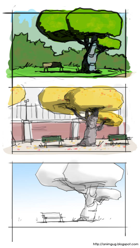
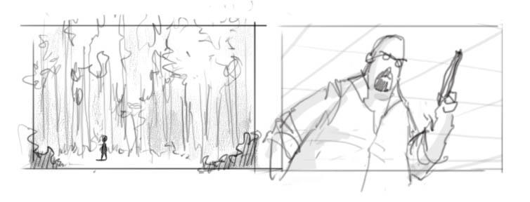
As promised, here are some attempts of exploring environment ideas for my short. The first one was supposed to be a quick exploration sketch, but got out of hand and ended up taking a couple of hours. I still like the result though... The other 3 were done very quickly. Hope you like.
All in Photoshop.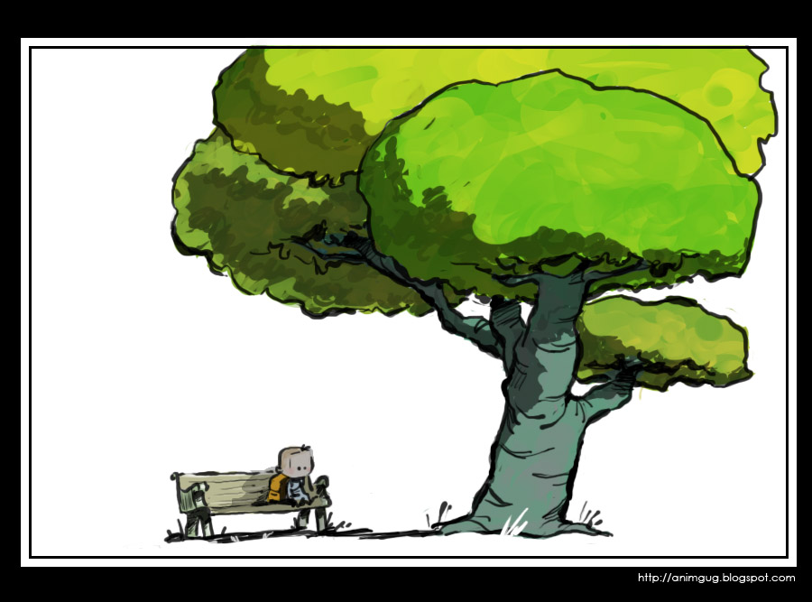
Saturday, November 25, 2006
Infinite Options Paralysis
Part of the difficulty with making your own short film (or any major creative project, for that matter), is that anything is possible. Think about it: ANYTHING.
So, I hear you ask - isn't that the fun part? Well sort of, but here's the problem: imagine one day someone comes to you and says, you know what - for the next 5 years, you can do anything you want. No limits at all, not even physical limits. Wanna go and live on the sun for 2 months? Go ahead. It's possible.
What do you do?
You see the difficulty? There are just too many great options. No matter what you come up with, there's something even MORE wonderful that you're missing out on. For me, this can be a paralyzing thought.
One of the symptoms of this "infinite options paralysis" is going in one direction for a while, then changing your mind, taking a different route, then changing your mind again, and so on - until you get completely confused about where the hell you're going and why. I've seen it happen to others, and I've done it myself. In fact, I'm doing it right now... I'm trying to figure out if I should stay with my latest idea, or go back to the original silly animation gag idea (the one with the purple alien), which is far easier for me to make. So far I'm leaning towards the gag - perhaps using it as as an experiment before going on to the more serious project.
Hmmm....this was supposed to be about environment concept art, but ended up with too many words. I'll post the sketches next time. Stay tuned...
Thursday, November 23, 2006
Recommended blog: Temple of the Seven Golden Camels
Just after I published my "symbolism in staging" post, I got to read an excellent post by storyboard artist Mark Kennedy, about character introductions. I think some of what he writes there is strongly related to the subject of symbolism, particularly the part about Disney's Cruella de Vil.
Anyway, this is an excellent opportunity to recommend this remarkable blog. Mark is very active, writing his own ideas as well as uploading tons of reference and instructional material from master draftsmen. He presents interesting topics in story development, design, composition, and more. If you're at all interested in any aspect of storyboarding, this is a blog for you:
Temple of the Seven Golden Camels
Find other recommendations under the label "hot links" (or click here). All recommended posts appear on the side bar to your right. Check them out!
Tuesday, November 21, 2006
Labeled!
Good news guys! I've gone through my blog and labeled all my posts. You can see the full list of labels (sorted by frequency) on the side banner on your right. Click a label, and you get all the posts under that label. Isn't that cool? :)
Saturday, November 18, 2006
Symbolism in staging - 1
For several months now, I’ve been spending a lot of my time at work storyboarding. Fortunately, my boss is an excellent storyboard artist, and I got to learn a lot from his comments on my work.
One of the interesting things he introduced me to, was the use of visual symbolism. What does that mean? Well, it means using composition to visually hint the audience about the characters and their relationships.
Yeah yeah, we know
Yes, we’re all familiar with the classic tricks of the trade: a small character in a huge background conveys the character feeling alone and insignificant, an up shot angle makes the character feel powerful and intimidating, and so on.
However, using tricks is different than understanding the profound ideas they represent. Visual symbolism is a strong communication tool that can be used in almost every shot, not just in special predefined cases.
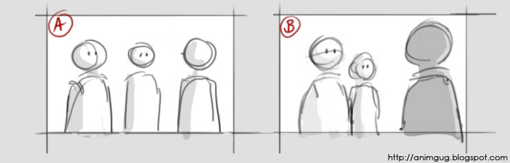
Consider the following situation: two characters confront a third character - say, two students ask their professor to postpone a test. The sketch bellow shows two ways of staging the conversation:
Get in shape
First, let’s look at the silhouette.
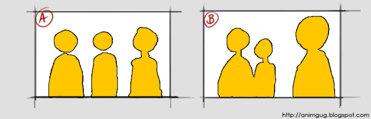 Notice that in picture B, there are two distinct shapes: “students shape” and “professor shape”. This visually communicates to the viewer that in this particular situation, the students are grouped together against the professor. Picture A says “Mike, Jane, professor”; picture B says “students, professor”.
 Divide and conquer
Next, let’s have a look at the way the characters divide the screen space:
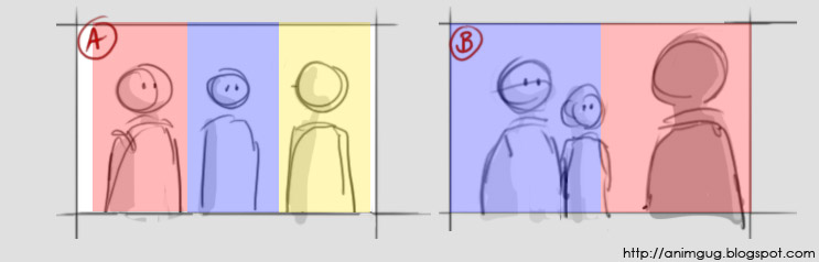
In picture A the screen is divided to thirds. The characters seem to “share” the screen, which makes the conversation feel more friendly. We want to suggest confrontation, so in staging B, the two “groups” are placed on either side of an imaginary middle line. This visually communicates “they’re on one side, he’s on the other side” – in other words, confrontation.
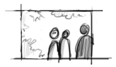
Here, the students are still silhouetted together, but now the characters don’t cut the screen in half. While we still have two “groups”, I don’t think this feels as confrontational as the original.
Made you look!
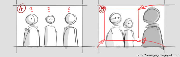
Picture A is confusing to the audience: who’s the main character? Where should we focus our attention? Notice how picture B creates an area of interest around the students’ faces. Being in the front, the guy on the left becomes the obvious star of this particularly shot. Try to look at any other area of the shot, and your eyes get almost forced into looking at him.
All this doesn’t mean that picture A is “bad staging” and must never to be used. For example, if we had a situation where three friends who got lost are trying to figure out where to go next - this shot could be perfect! It suggests exactly friendship, individual opinions, and confusion. Staging B, as we’ve seen, communicates confrontation and hierarchy. The two sketches tell us two very different stories, with nothing but pure staging – no poses, text, or facial expressions!
Friday, November 17, 2006
Saturday, November 11, 2006
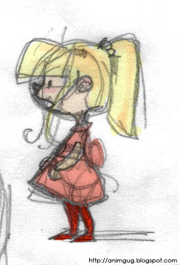
A journey begins...
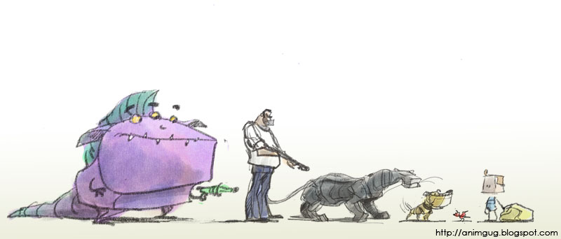
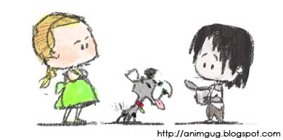
This here is the rather silly beginning of a short film I'm currently working on. It started out, as animation shorts sometimes do, with a need to beef up my portfolio. So I cooked up an idea involving a lots of different creatures: kids, grown ups, birds, 4 legged animals, huge purple aliens - it had everything! The story itself was nothing fancy, just a silly gag - but it provided a fair excuse for lots of fun animation. So, as long as I wasn't trying to sell it as the story of the century, I figured it'll do the work.
Anyway, soon after drawing the character study above, the idea kind of took off and evolved into a real story. The new story has only a few characters and, unfortunatelly, no purple aliens. On the other hand, it does have meaning and honesty and drama. Can't win 'em all, I guess...
As a lesson from past experiences, I've decided this is not going to be a "project" - it's going to be a hobby. So I'm kind of playing around with it. I don't know if and when it will be finished, and I don't care. We'll just see what happens.
This blog is probably going to become a bit of a project blog - probably more than half the posts are going to be short-related. Hope you guys enjoy the ride; I certainly do.
Saturday, October 28, 2006
Phone doodle

I was doing some portfolio work on photoshop, when my mom skyped me. We had quite a long conversation, and when we disconnected... I suddenly realized I've been working the wacom the whole time! :)
Thursday, October 19, 2006
Sunday, October 15, 2006
I'm BACK!
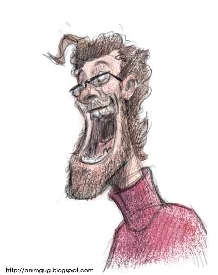
Hello all you imaginary readers of this blog - I'm back! I didn't have internet at home for 6 weeks - can you imagine? I sure couldn't...But it was actually good for me. I think I got a bit too hooked on the net these last two years.
So, here's a little sketch to get things re-started. Cheers everybody!
Subscribe to:
Posts (Atom)


