
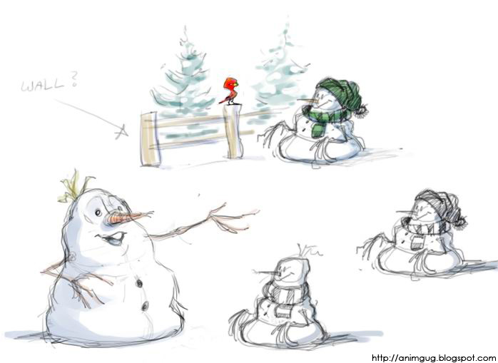
Some morning "free-ride" sketches. I find interesting things tend come out when I don't really try to "design" anything specific, just doodle away and see where the pencil wants to go. For me, the best time for it is early morning, before my head is buzzing with the troubles and urgencies of the day. It also makes me feel I've done something nice for me, so no matter how the day turns out, it can't possibly be a total loss. And that's quite a lot, actually.
Sunday, July 16, 2006
Snowman and bird

Monday, July 03, 2006
Tuesday, June 27, 2006
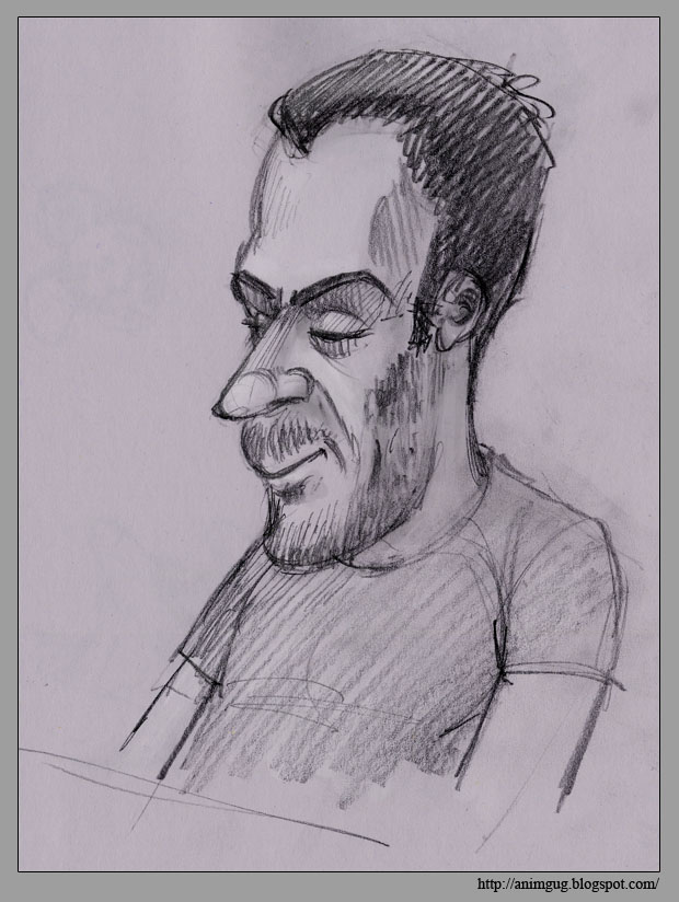
Recommanded blog: John Nevarez
There are some great draftsmen whose work is understandable to me. What I mean is, that when I look at their sketches, I can see how they did it - I can follow the way they use the various draftsmenship principles, and admire their excellence in putting it all together.
Then there are those whose work is a mystery to me. It's good, it's wonderful, but I can't figure out how they did it. I can't even figure out WHY it's so great. All I know is that I look at it and I love it. John Nevarez's work is a good example for that sort of stuff. Have a look:
Tuesday, June 20, 2006
Sunday, June 18, 2006
Tuesday, June 13, 2006
My first "color key" ever!
 This color sketch is the result of a nice sunny bicycle trip through the Amager woods. I was fascinated with the contrast between the sunny, dry, empty bicycle paths and the shadowy, moist atmosphere under the trees, swarming with bugs and birds and what-not . I looked at it for a long time, and the next morning I tried to capture my visual impression. I know it's very simple and very crude, but it's my very first success in capturing feeling with color, and I like it :).
Monday, June 05, 2006
KL caricature
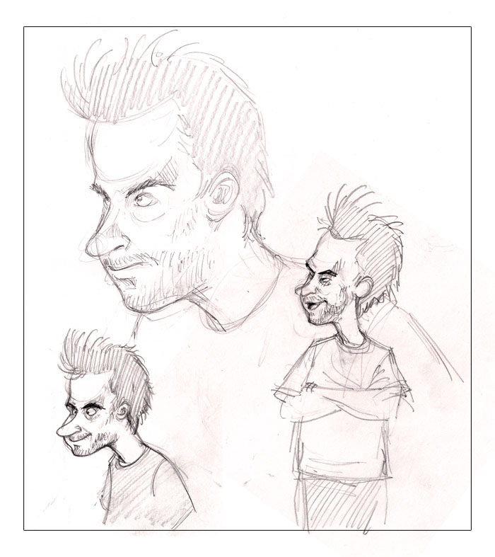 During life-drawing sessions at work, it became something of a habit of mine to ease my brain for a while by attempting a caricature of one of my collegues. I'm not a very good caricaturist, so usually it's not really recognizable - but these "breather" drawings do tend to come out quite interesting and expresive, anyway.
This here is my friend and boss, KL. The big one is the first study (notice the concentrated life drawing expression...) which is always rather realistic and stiff. Then come the fun part! The lower left drawing is the one I like best. I don't think KL liked it much though...wonder why.
Saturday, June 03, 2006
The form dog and the shape dog
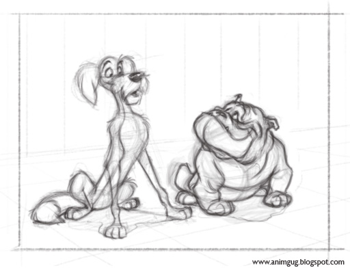
Here is another copy of a Disney frame (Lady and the Tramp, of course). I think you'll agree that the lean dog on the left is much better than the bulldog in terms of solid draftsmanship. Fortunately I saved the drawing in it's most raw stage, after just a few line strokes had been made, and here it is: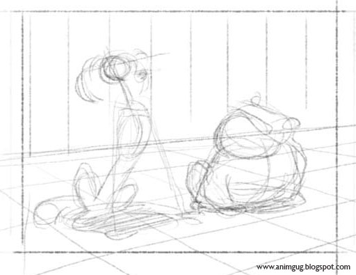 This early stage shows a very interesting thing. While the bulldog here is basically a vague, undefined shape, the lean dog is already defined with forms. Obviously, I had approached the drawing with a pretty clear understanding of the lean dog's construction, and almost no understanding of the bulldog's.
[By the way, as a result of this lack of understanding, drawing the lean dog was easy and fun, while drawing the bulldog was frustrating and painstaking and felt like 'work'.]
Here you can see the work process I went through. You can see how much more trouble I had with the bulldog.
Well, you live you learn (and then you live on and learn the same thing over and over again, until hopefully, some day, you get tired of making the same mistake all the time and start doing it RIGHT).
Cheers.
Animation thumbnails
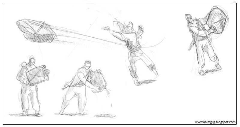 I spent a whole day doing some staggeringly boring and lifeless posing for this scene (in 3D). Luckily I came to my senses, realized what I was doing, deleted the file, and spent about half an hour sketching some thumbnails (sample above). Within another few hours, the scene became not only a hell of a lot better, but also more fun to work on. Repeat after me: I will think before I animate!
Tuesday, May 30, 2006
Recommanded blog: The Firehouse Stomp
I found this one a few days ago. A very talented animator named Nick Sung from Toronto, Canada, is making an independent short in the spirit of old Disney designs and animation style. The blog includes some really great artwork, but to me its real value lies in that it shows the creative process - not just the final results. There are thumbnails, raw storyboards, doodles, inspirationsal art, color experiments, the whole deal. Very inspiring. Check it out!
The Firehouse Stomp
Sunday, May 28, 2006

Saturday, May 27, 2006
Daily Disney copy: Melody Time
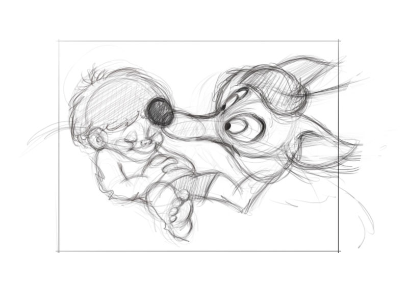 A few months ago, in a moment of animation-geek weakness, I bought myself the 2006 Disney Day to Day Calendar. It has daily prints from Disney animation films throughout the years, each with a few words about the film. Needless to say, I never actually used the thing :)
A few days ago I decided to try sketching a daily copy of the daily frame. I seems like a good way of exploring different drawing styles and characters, as well as principles of composition and layout. This one is a free copy of a frame from Melody Time (1948). I didn't really try to make an exact copy, or even be on model; instead, I tried to capture the essence of the frame's appeal and composition.
C&C is more than welcome!
Blacks and whites on gray

A little experiment using blacks and whites on gray background (done in Photoshop). As usual, changing the tools/materials kicks me out of my usual drawing habits and makes drawing more exciting. This may not be my greatest drawing ever, but it was real fun to make.
I used the photoshop noise filter to get the non-smooth gray BG. I think it makes the surface look more "alive". The best option, of course, would have been to scan an empty paper and darken it to gray...but I got lazy.
Wednesday, May 24, 2006
You're being silly, deer

One of my Danish class absent-minded doodling papers. I'm not sure my Danish is getting any better, but I'm having a lot of fun with the pencil!
I like the silliness of the deer. The coloring was made in Photoshop. The way the white goes into the picture is inspired by the work of Gabriel Pennacchioli (http://gabrielepennacchioli.blogspot.com) - I sure hope he didn't patent it ...
Of course it doesn't look as great as when he does it, but what the hey, you gotta make do with what you got = :0)
Saturday, May 20, 2006

Tuesday, May 09, 2006
Photoshop brush fun
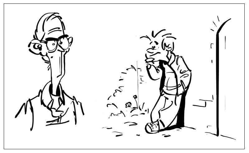 Just a bit of toying around with a big fat photoshop brush, letting the brain just come up with something. Interesting how deeply the tool I use influences my drawing style.
Friday, April 21, 2006
The Green Monster of AAARRRGGHHHH
 Just a silly creature from one of my early morning sketching sessions. I think the coloring got a bit too green, which I decided to solve by giving it a title that would make it look like an artistic choice :)
Friday, April 14, 2006
Louisiana Museum

Yesterday, as an Easter treat, I visited the Louisiana Museum of Modern Art, a little north to Copenhagen. Now, I'm not a big fan of museums, especially when it comes to modern art; but I decided to be open minded this time. I wanted to enjoy what's interesting to me, and disregard the rest.
On the whole, I enjoyed the experience, maybe even got a little inspired. Regrettably, I was also reminded of all the things I dislike about museums in general: the pompousness, the almost complete lack of humor and , the strict rules (in this museum, for example, walking around with your bag on your back is not allowed. You have to carry it at your side), the quiet and echoing of footsteps in large chambers that communicate holiness. In short, museums are unpleasant places, and it's a shame, because I think art is the heart and soul of culture. Who wants his soul to reside in such a place?
But, as I was saying before I went into a rant... I actually did enjoy the ride. The sketch above is of an interestingly proportioned sculpture by Alberto Giacometti. The line drawing was made at the museum (very quick and dirty, it isn't - and was never intended to be - an exact representation of what the sculpture looks like. It's more like my personal impression of it). The colored thing is a strange photoshop experiment based on the line sketch. The picture is something I found on the net - the artist working on what seems to be the very same piece.
Wednesday, April 05, 2006
From my future photo album
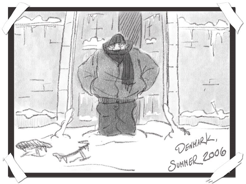
So we're well into April, and yesterday it snowed again. I'm afraid summer had been canceled due to bad weather.
Tuesday, April 04, 2006
Subscribe to:
Posts (Atom)


