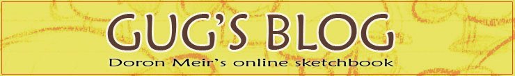
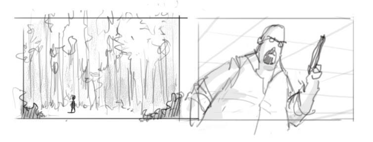
As promised, here are some attempts of exploring environment ideas for my short. The first one was supposed to be a quick exploration sketch, but got out of hand and ended up taking a couple of hours. I still like the result though... The other 3 were done very quickly. Hope you like.
All in Photoshop.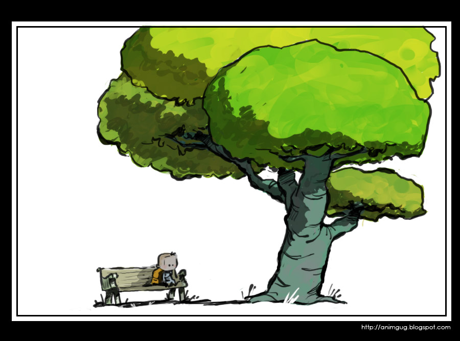
Sunday, November 26, 2006
Environment concept sketches
Saturday, November 25, 2006
Infinite Options Paralysis
Part of the difficulty with making your own short film (or any major creative project, for that matter), is that anything is possible. Think about it: ANYTHING.
So, I hear you ask - isn't that the fun part? Well sort of, but here's the problem: imagine one day someone comes to you and says, you know what - for the next 5 years, you can do anything you want. No limits at all, not even physical limits. Wanna go and live on the sun for 2 months? Go ahead. It's possible.
What do you do?
You see the difficulty? There are just too many great options. No matter what you come up with, there's something even MORE wonderful that you're missing out on. For me, this can be a paralyzing thought.
One of the symptoms of this "infinite options paralysis" is going in one direction for a while, then changing your mind, taking a different route, then changing your mind again, and so on - until you get completely confused about where the hell you're going and why. I've seen it happen to others, and I've done it myself. In fact, I'm doing it right now... I'm trying to figure out if I should stay with my latest idea, or go back to the original silly animation gag idea (the one with the purple alien), which is far easier for me to make. So far I'm leaning towards the gag - perhaps using it as as an experiment before going on to the more serious project.
Hmmm....this was supposed to be about environment concept art, but ended up with too many words. I'll post the sketches next time. Stay tuned...
Thursday, November 23, 2006
Recommended blog: Temple of the Seven Golden Camels
Just after I published my "symbolism in staging" post, I got to read an excellent post by storyboard artist Mark Kennedy, about character introductions. I think some of what he writes there is strongly related to the subject of symbolism, particularly the part about Disney's Cruella de Vil.
Anyway, this is an excellent opportunity to recommend this remarkable blog. Mark is very active, writing his own ideas as well as uploading tons of reference and instructional material from master draftsmen. He presents interesting topics in story development, design, composition, and more. If you're at all interested in any aspect of storyboarding, this is a blog for you:
Temple of the Seven Golden Camels
Find other recommendations under the label "hot links" (or click here). All recommended posts appear on the side bar to your right. Check them out!
Tuesday, November 21, 2006
Labeled!
Good news guys! I've gone through my blog and labeled all my posts. You can see the full list of labels (sorted by frequency) on the side banner on your right. Click a label, and you get all the posts under that label. Isn't that cool? :)
Saturday, November 18, 2006
Symbolism in staging - 1
For several months now, I’ve been spending a lot of my time at work storyboarding. Fortunately, my boss is an excellent storyboard artist, and I got to learn a lot from his comments on my work.
One of the interesting things he introduced me to, was the use of visual symbolism. What does that mean? Well, it means using composition to visually hint the audience about the characters and their relationships.
Yeah yeah, we know
Yes, we’re all familiar with the classic tricks of the trade: a small character in a huge background conveys the character feeling alone and insignificant, an up shot angle makes the character feel powerful and intimidating, and so on.
However, using tricks is different than understanding the profound ideas they represent. Visual symbolism is a strong communication tool that can be used in almost every shot, not just in special predefined cases.
Consider the following situation: two characters confront a third character - say, two students ask their professor to postpone a test. The sketch bellow shows two ways of staging the conversation:
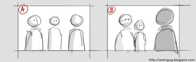
Get in shape
First, let’s look at the silhouette.
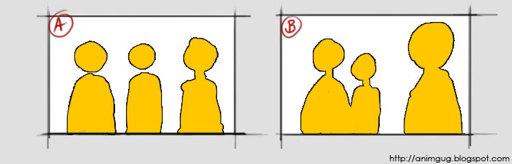 Notice that in picture B, there are two distinct shapes: “students shape” and “professor shape”. This visually communicates to the viewer that in this particular situation, the students are grouped together against the professor. Picture A says “Mike, Jane, professor”; picture B says “students, professor”.
 Divide and conquer
Next, let’s have a look at the way the characters divide the screen space:
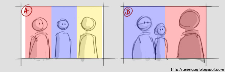
In picture A the screen is divided to thirds. The characters seem to “share” the screen, which makes the conversation feel more friendly. We want to suggest confrontation, so in staging B, the two “groups” are placed on either side of an imaginary middle line. This visually communicates “they’re on one side, he’s on the other side” – in other words, confrontation.
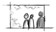
Here, the students are still silhouetted together, but now the characters don’t cut the screen in half. While we still have two “groups”, I don’t think this feels as confrontational as the original.
Made you look!
Picture A is confusing to the audience: who’s the main character? Where should we focus our attention? Notice how picture B creates an area of interest around the students’ faces. Being in the front, the guy on the left becomes the obvious star of this particularly shot. Try to look at any other area of the shot, and your eyes get almost forced into looking at him.
All this doesn’t mean that picture A is “bad staging” and must never to be used. For example, if we had a situation where three friends who got lost are trying to figure out where to go next - this shot could be perfect! It suggests exactly friendship, individual opinions, and confusion. Staging B, as we’ve seen, communicates confrontation and hierarchy. The two sketches tell us two very different stories, with nothing but pure staging – no poses, text, or facial expressions!
Friday, November 17, 2006
Saturday, November 11, 2006
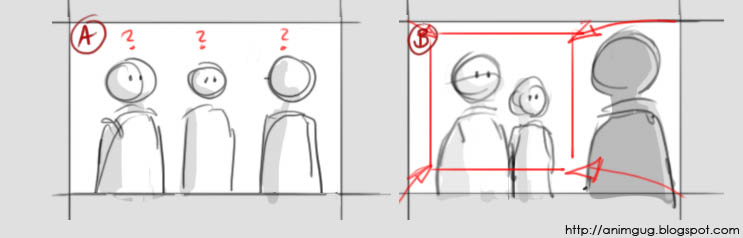
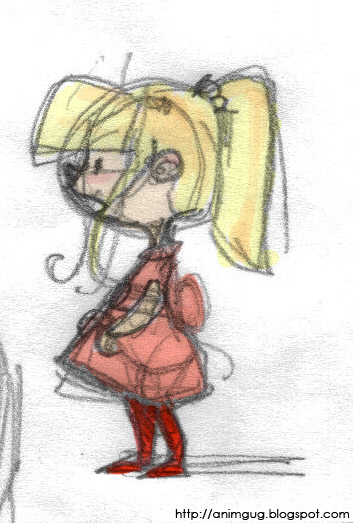
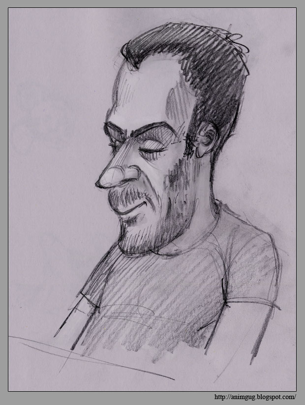
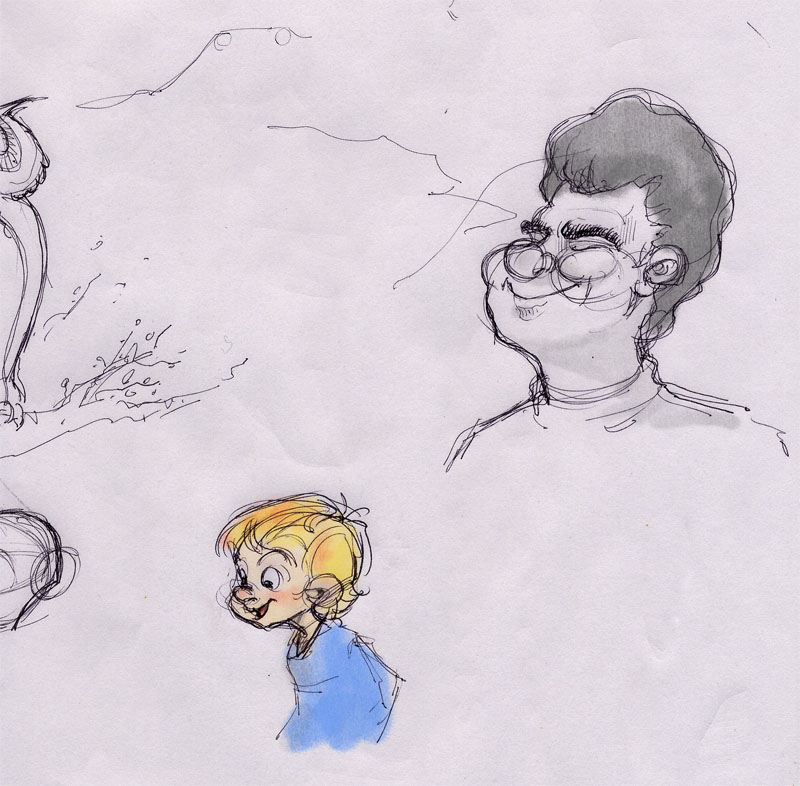
A journey begins...
This here is the rather silly beginning of a short film I'm currently working on. It started out, as animation shorts sometimes do, with a need to beef up my portfolio. So I cooked up an idea involving a lots of different creatures: kids, grown ups, birds, 4 legged animals, huge purple aliens - it had everything! The story itself was nothing fancy, just a silly gag - but it provided a fair excuse for lots of fun animation. So, as long as I wasn't trying to sell it as the story of the century, I figured it'll do the work.
Anyway, soon after drawing the character study above, the idea kind of took off and evolved into a real story. The new story has only a few characters and, unfortunatelly, no purple aliens. On the other hand, it does have meaning and honesty and drama. Can't win 'em all, I guess...
As a lesson from past experiences, I've decided this is not going to be a "project" - it's going to be a hobby. So I'm kind of playing around with it. I don't know if and when it will be finished, and I don't care. We'll just see what happens.
This blog is probably going to become a bit of a project blog - probably more than half the posts are going to be short-related. Hope you guys enjoy the ride; I certainly do.
Saturday, October 28, 2006
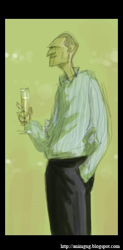
Phone doodle

I was doing some portfolio work on photoshop, when my mom skyped me. We had quite a long conversation, and when we disconnected... I suddenly realized I've been working the wacom the whole time! :)
Thursday, October 19, 2006
Sunday, October 15, 2006
I'm BACK!

Hello all you imaginary readers of this blog - I'm back! I didn't have internet at home for 6 weeks - can you imagine? I sure couldn't...But it was actually good for me. I think I got a bit too hooked on the net these last two years.
So, here's a little sketch to get things re-started. Cheers everybody!
Tuesday, August 29, 2006
Strange animal
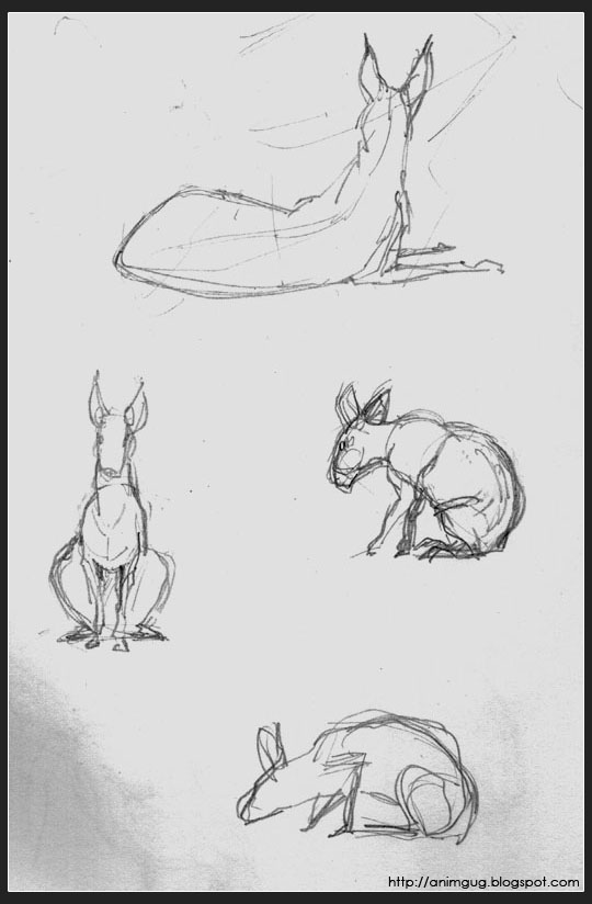
Can't remember what was the name of that creature. It was a good animal for quick sketching: every minute or so it would move a little bit, then hold quite still untill the next move. A pro life drawing model!
Thursday, August 24, 2006
Still alive...
 If anybody asks himself if I've deserted the blog, then the answer is NO. The past few weeks had been anything but routine, and the coming few weeks are going to be pretty strange as well. I don't get to draw very much (not for fun anyway). I get to do plenty of other interesting stuff though, so hopefully they in turn will inspire the drawing department.
Here is a little morning doodle, just to keep things alive. More to come....
Saturday, August 12, 2006
My site is finally updated!
After about 3 years of almost no updates on my internet site, feeling a stab of embarrassment every time someone says "hey, I looked at your site", I finally foung the time and energy to re-design it and update the material. I'm probably going to tone down some of the colors (having been threatened with various degrees of torture if I don't), but basically I'm pretty pleased with the result. I hope you like it!
www.doronmeir.com
P.S. I made a very cute and funny drawing for this post, but you're going to have to take my word for it because Photoshop crashed on me EXACTLY when it was ready to be saved. I kid you not.
Wednesday, August 02, 2006
Quicksketch: Den Gamle By
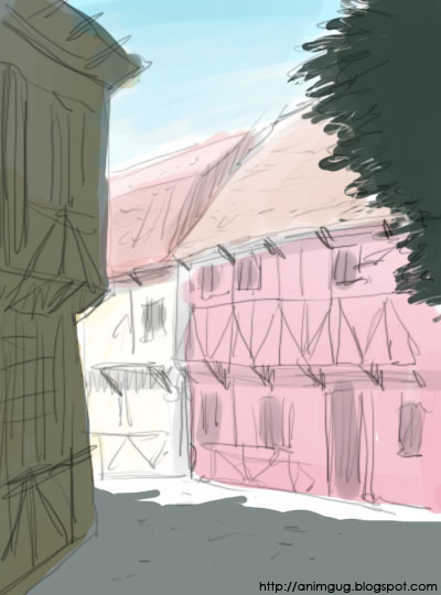
If you like the charm of old-fashioned stuff and happen to visit denmark, be sure to go to Den Gamle By (The old town) in the city of Aarhus. It's an open air museum built like an old maket town from the 1800's or so. If you're really into such things, like I am, I also recommand the excelent museum book they sell in the souvenir shop. It's loaded with excelent pictures and interesting text, not just about the museum but also describing what life used to be like in these small market towns.
A while ago I was whining here about the pompousness, strictness and lack of entertainment in museums in general. I was therefore very pleased to read the following lines in my "Den Gamle By" book: "museum visits should be enjoyable. The museum's staff are aware that it is the visitor's spare time and that too much instructing and patronising may easily spoil their day". Hear hear, guys!
This here is a very very quick composition study, trying to capture some of the charm of the place. Don't know if I succeeded. Maybe I'll develop it further at some point.
Sunday, July 16, 2006
Snowman and bird
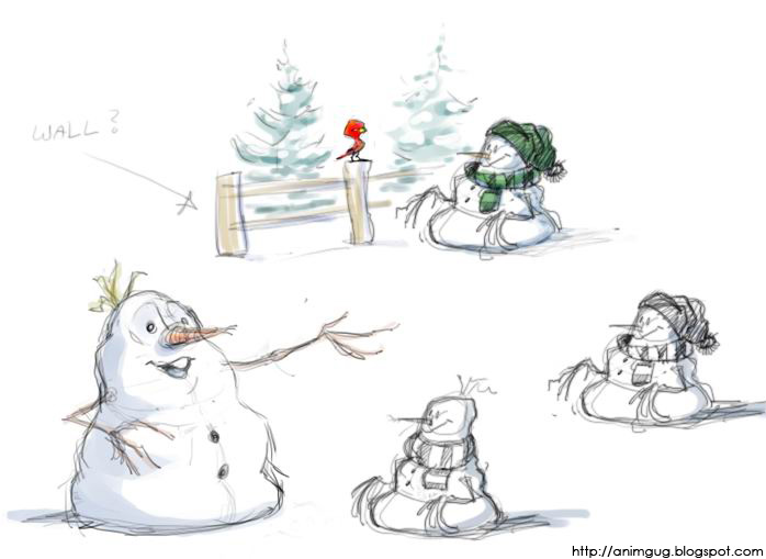
Some morning "free-ride" sketches. I find interesting things tend come out when I don't really try to "design" anything specific, just doodle away and see where the pencil wants to go. For me, the best time for it is early morning, before my head is buzzing with the troubles and urgencies of the day. It also makes me feel I've done something nice for me, so no matter how the day turns out, it can't possibly be a total loss. And that's quite a lot, actually.
Monday, July 03, 2006
Tuesday, June 27, 2006
Recommanded blog: John Nevarez
There are some great draftsmen whose work is understandable to me. What I mean is, that when I look at their sketches, I can see how they did it - I can follow the way they use the various draftsmenship principles, and admire their excellence in putting it all together.
Then there are those whose work is a mystery to me. It's good, it's wonderful, but I can't figure out how they did it. I can't even figure out WHY it's so great. All I know is that I look at it and I love it. John Nevarez's work is a good example for that sort of stuff. Have a look:
Tuesday, June 20, 2006
Sunday, June 18, 2006
Subscribe to:
Posts (Atom)
