Monday, May 25, 2009

Playing with facial shapes


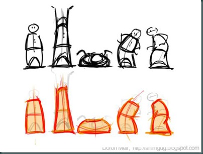
I drew all four during one of our longer “dailies” meetings at Snowball. The upper left one was the inspiration for the other four (loosely based on my friend Nir G., though it looks more like his evil twin…sorry Nir!)

The other three are my attempts to interpret and accentuate the special feature of the first drawing: mainly the forehead and the jaw. My favorite interpretation is the cubical dude.

I noticed that I somehow I got much better at controlling my lines, even though I don’t use pencil so much – it’s mainly Wacom these days. Maybe it’s because the Wacom is so hard to control? Either way, I’m not complaining :)

Saturday, May 23, 2009

"Skinners" pitch

This is my pitch assignment for Kris Pearn's storyboarding course at Schoolism.com. I have to confess, this turned out to be rather difficult. Pitching requires a certain fluidity of speech that I'm not sure I can even muster in Hebrew, and definitely not in English. In the end, I just opened Premiere and edited out a lot of slowness and stuttering. I think the result is not so bad.

Comments and thoughts and also critique, are even more welcome than usual.

Friday, May 22, 2009

Friday, May 15, 2009

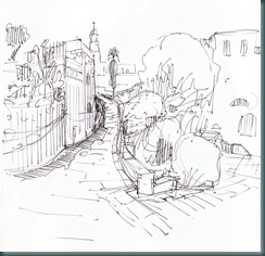
More Jaffa sketches

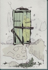
misgad

When I sketch outdoors, I often get into exploring something in different ways, trying to really “get it”. This is just a small part, I had several pages full of this thing :)

small_street copy

window_paint

Sunday, May 10, 2009

Old Jaffa house x 3

I’m not terribly good with drawing landscapes. As an animator, people and gestures are my thing. But here and there I give it a go, just to make sure I still suck. :)

So there was this house/restaurant down in Old Jaffa, and as usual I had a hard time drawing it. I made several attempts before I was relatively satisfied with this one:
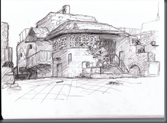
old_jaffa

With me and sketching that very house was my good friend JP Vine, who’s as good as anybody at drawing these kind of things. I looked at his results and asked some questions, then I tried to capture it “JP style”:
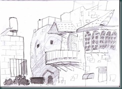
JP-style

I think this result is much more fun, and even though it’s not structurally accurate at all, it retains much more of the building’s charm.

Back home, I scanned my initial attempt and I stared at it for a while on screen (always helps to see your work in a different way). I realized the main problem is that the drawing is drowning in detail. It’s flat, not just because there isn’t really a definite light source, but also and primarily because all the details have the same weight, the same level of importance in my drawing.

So I asked myself - what’s the most important thing about this house? What made it worth painting? I experimented with several answers. The answer that presented itself in the end took me a little bit by surprise. Turns out it wasn’t so much the architecture that got me interested - it was actually the colors. So, here’s the Photoshop sketch I did at home, trying to limit myself to what really matters:
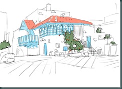
old_jaffa_revisited

So…thanks for reading this relatively long post. Any thoughts on which drawing does a better job and why? My comments area is open for your input.

Wednesday, May 06, 2009

Head’s up

Head_statue_sketch01

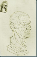
This is the first time I succeeded in doing a long, serious sketch from a sculpture. I tried it several times, but “on location” I can never muster the patience. So much to see!

This one was different, it’s my own sculpture which I have at home and I just took it outside, placed it under a single light source, and allowed myself to get lost in the drawing. It was very relaxing.

The small version on the upper corner is something between a warm-up and a quick “proof of concept”. I find that doodling these little quick sketches before I start drawing, helps a lot in keeping me focused on what I’m going for.

I got tired for drawing before I got to start shading it. Maybe I’ll continue the drawing some other day.

Friday, May 01, 2009

Flexi-tips part 1

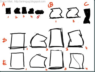
flexi08 A: Flexi symbols: (1) normal state, (2) bend, (3) stretch, (4) twist, (5) squash.

B+C: The silhouette of twist is reinforced with overlap lines (also called “T’s”), indicating depth.

D: readable, feels like rubber.

E: not very readable (esp. silhouette), feels flat and weightless.

Applied to a simple character:

flexi11

flexi17-18