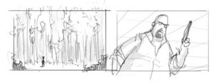
For several months now, I’ve been spending a lot of my time at work storyboarding. Fortunately, my boss is an excellent storyboard artist, and I got to learn a lot from his comments on my work.
One of the interesting things he introduced me to, was the use of visual symbolism. What does that mean? Well, it means using composition to visually hint the audience about the characters and their relationships.
Yeah yeah, we know
Yes, we’re all familiar with the classic tricks of the trade: a small character in a huge background conveys the character feeling alone and insignificant, an up shot angle makes the character feel powerful and intimidating, and so on.
However, using tricks is different than understanding the profound ideas they represent. Visual symbolism is a strong communication tool that can be used in almost every shot, not just in special predefined cases.
Consider the following situation: two characters confront a third character - say, two students ask their professor to postpone a test. The sketch bellow shows two ways of staging the conversation:

Get in shape
First, let’s look at the silhouette.
 Notice that in picture B, there are two distinct shapes: “students shape” and “professor shape”. This visually communicates to the viewer that in this particular situation, the students are grouped together against the professor. Picture A says “Mike, Jane, professor”; picture B says “students, professor”.
 Divide and conquer
Next, let’s have a look at the way the characters divide the screen space:

In picture A the screen is divided to thirds. The characters seem to “share” the screen, which makes the conversation feel more friendly. We want to suggest confrontation, so in staging B, the two “groups” are placed on either side of an imaginary middle line. This visually communicates “they’re on one side, he’s on the other side” – in other words, confrontation.

Here, the students are still silhouetted together, but now the characters don’t cut the screen in half. While we still have two “groups”, I don’t think this feels as confrontational as the original.
Made you look!
Picture A is confusing to the audience: who’s the main character? Where should we focus our attention? Notice how picture B creates an area of interest around the students’ faces. Being in the front, the guy on the left becomes the obvious star of this particularly shot. Try to look at any other area of the shot, and your eyes get almost forced into looking at him.
All this doesn’t mean that picture A is “bad staging” and must never to be used. For example, if we had a situation where three friends who got lost are trying to figure out where to go next - this shot could be perfect! It suggests exactly friendship, individual opinions, and confusion. Staging B, as we’ve seen, communicates confrontation and hierarchy. The two sketches tell us two very different stories, with nothing but pure staging – no poses, text, or facial expressions!


9 comments:
Great article, as allways.
fun to read, fun to watch and you learn something at the end. just like a kinder chocolate egg.
keep it up !!
Good stuff!
Thanks :)
great article, and i really like all your drawings...
you are invited to check out my sketch-group blog too :-)
I came across your blog from Marcos Mateu's - it's wonderful! I do love the sketches and the characters for your short.
And this tutorial rocks too! I had a great time reading it!
--Shuku
Thanks y'all!
Omer - glad to see you didn't let the lack of an actual subway stop you. Who knows, maybe I'll join when I get back.
hey doron thanks for the visit!
about the subway, i have no idea how the other groups in the world manage to draw in such a crowded place anyways...
it will be an honor to see you drawing with us someday...
take care, omer ;-)
Very interesting. Thank you for sharing.
Great Article
like your drawings
keep us update for more articles
cute.
Post a Comment