In part 4 we finally start looking into the smoothing process. We begin with a short study of the inherent timing cheat involved in stepped animation. Enjoy!
In part 4 we finally start looking into the smoothing process. We begin with a short study of the inherent timing cheat involved in stepped animation. Enjoy!
In the second part of the tutorial, we add some motion info to our raw acting keys. I show how to use the tweenMachine script to introduce inbeweens and breakdowns.
I’m using here a very old version of tweenMachine here (an old dog likes his old tricks). The new version has a far more advanced UI and the numbers work a bit differently, but the essence of its function stays the same.
This took much much more time than I had expected. In the end, the only thing I’m entirely pleased about is the little guitar tune I played :)
I watched the Disney short "Brave Little Tailor" for the first time the other day, and one sequence clearly stood out with complex animation and great appeal. It was the sequence in which Mickey tells the king his tale of bravery. I later discovered it was animated by Frank Thomas, which explains the outstanding quality.
I was inspired to do a classic animation exercise with it. Here's what I did: I quick-sketched about 20 drawings that seemed to be the major key drawing (they are the ones with the circled frame numbers). Then, I animated the scene according to theses keys, without looking at the original scene again. The idea was to compare my results with the original animation, and see what I might have done better. It was a great exercise and I feel I learned a lot from it. The result also shows, I think, how solidly you can define 4 seconds of animation with just 20 very quick sketches.
Note: YouTube is apparently not so good with short videos like this (it won't play it through. To get a better look at it, try the mp4 file here.

It got canned, by the way. Turns out what the client really really wanted was an owl. :-D
This is beautiful, this is one of my best finds yet. It’s a blog on the “New Yorker” site. It’s too rare to find something which is both “arty” and fun; artists tend to take themselves so seriously! Anyway, have a look, and make sure to check out some older entries. Here’s a good one to get you started:
Well what do you know, I’m not dead after all... I was just very focused on my secret project, a book I’ve been working on for the past 5 years (!). I’ll write more about it soon; for now, I’m happy to say I finished the first draft, and I hope and believe that re-writing is going to be much easier than writing.
As soon as I finished the thing I was called to the army for a couple of weeks (routine stuff), and while I was there I sketched these (ballpoint pen). The colors are Photoshoped in.
Audio interviews are great. You can carry them around on your MP3 player and listen to them while driving, washing dishes or standing in a particularly long line at your favorite government institution.
Here’s a great resource of MP3 interviews with many great artists. They have quite a few prominent animation people on: Brad Bird, Pete Doctor, Chuck Jones, Tim Burton.
Enjoy
From a quick-sketching session at Snowball VFX. To be continued – there' are also some Baloo sketches.
I drew all four during one of our longer “dailies” meetings at Snowball. The upper left one was the inspiration for the other four (loosely based on my friend Nir G., though it looks more like his evil twin…sorry Nir!)
The other three are my attempts to interpret and accentuate the special feature of the first drawing: mainly the forehead and the jaw. My favorite interpretation is the cubical dude.
I noticed that I somehow I got much better at controlling my lines, even though I don’t use pencil so much – it’s mainly Wacom these days. Maybe it’s because the Wacom is so hard to control? Either way, I’m not complaining :)
This is my pitch assignment for Kris Pearn's storyboarding course at Schoolism.com. I have to confess, this turned out to be rather difficult. Pitching requires a certain fluidity of speech that I'm not sure I can even muster in Hebrew, and definitely not in English. In the end, I just opened Premiere and edited out a lot of slowness and stuttering. I think the result is not so bad.
Comments and thoughts and also critique, are even more welcome than usual.
When I sketch outdoors, I often get into exploring something in different ways, trying to really “get it”. This is just a small part, I had several pages full of this thing :)
I’m not terribly good with drawing landscapes. As an animator, people and gestures are my thing. But here and there I give it a go, just to make sure I still suck. :)
So there was this house/restaurant down in Old Jaffa, and as usual I had a hard time drawing it. I made several attempts before I was relatively satisfied with this one:
With me and sketching that very house was my good friend JP Vine, who’s as good as anybody at drawing these kind of things. I looked at his results and asked some questions, then I tried to capture it “JP style”:
I think this result is much more fun, and even though it’s not structurally accurate at all, it retains much more of the building’s charm.
Back home, I scanned my initial attempt and I stared at it for a while on screen (always helps to see your work in a different way). I realized the main problem is that the drawing is drowning in detail. It’s flat, not just because there isn’t really a definite light source, but also and primarily because all the details have the same weight, the same level of importance in my drawing.
So I asked myself - what’s the most important thing about this house? What made it worth painting? I experimented with several answers. The answer that presented itself in the end took me a little bit by surprise. Turns out it wasn’t so much the architecture that got me interested - it was actually the colors. So, here’s the Photoshop sketch I did at home, trying to limit myself to what really matters:
So…thanks for reading this relatively long post. Any thoughts on which drawing does a better job and why? My comments area is open for your input.
This is the first time I succeeded in doing a long, serious sketch from a sculpture. I tried it several times, but “on location” I can never muster the patience. So much to see!
This one was different, it’s my own sculpture which I have at home and I just took it outside, placed it under a single light source, and allowed myself to get lost in the drawing. It was very relaxing.
The small version on the upper corner is something between a warm-up and a quick “proof of concept”. I find that doodling these little quick sketches before I start drawing, helps a lot in keeping me focused on what I’m going for.
I got tired for drawing before I got to start shading it. Maybe I’ll continue the drawing some other day.

B+C: The silhouette of twist is reinforced with overlap lines (also called “T’s”), indicating depth.
D: readable, feels like rubber.
E: not very readable (esp. silhouette), feels flat and weightless.
Applied to a simple character:
After the lesson at Sapir college today, I decided to join my students for their sponge sculpting lesson. I chose to sculpt a sketch of Mike from my “Skinners” storyboard. Never tried sculpting in sponge before... The softness is a real challenge - it’s quite hard to be accurate. Here’s the result after half an hour for preparation, and about 3 hours of sculpting. Will post more pics as the work continues.
Savage chickens is a great comics blog. It’s funny and inventive, and very charming in the simplicity of its drawings. Check it out! [click the pic].
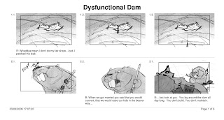
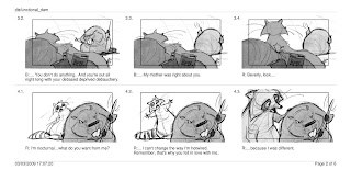
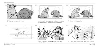
That took way too much time, but here it is. The script was a given, so all I did here was design the characgters and the envirnment, and board it.
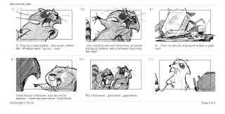
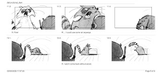
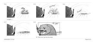


I forgot to mention that the "His or Hen's" story was developed by me and my girlfriend together. Couldn't have done it without her.
 I'm not much of a color person, somehow I get bored by very detailed color work. I threw in some colors just as an indication, but I wish I had the patience to really make a painting out of this. I can see a lot of opportunity for interesting lighting here.
Very solid drawing, nice flow of motion. It's not every day that you see that combination. Cudos!
This is really cool. I never knew they've reached this level of movement in animatronics!